Email Redesign
Strategy for Holistic Responsive Email Design Solution for CustomMade
Project Details
Upon joining the design team at CustomMade in July of 2013 I found myself bridging the gaps between a scrappy team of marketers struggling to use a difficult email toolset, and a design team where I was the sole designer with the necessary coding chops that would lend themselves to responsive email executions. There were 6 distinct templates, none of which worked properly for mobile devices. Due to internal process frictions, requests for email enhancements were time consuming and tricky—we seldom got back all of what was requested, and spent a lot of time trying to patch things up ourselves.
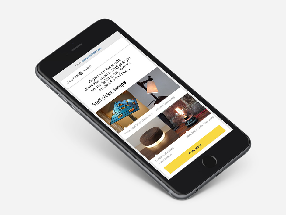
After six months of bandaid-fixing the existing solutions and kicking around potential new ideas, the team was ready to entertain a holistic redesign in 2014. Additionally we upgraded to a new ESP, and then identified we had a 49% mobile user base.
As Creative Lead, I approached the redesign with all subsets of our email channel in mind. The new unified template system had to work well for users on mobile devices, and degrade gracefully for users on outmoded softwares. Additionally the base structural markup had to be so easy to navigate that any person on our marketing team could jump in and make content edits whenever needed—A personal goal for the redesign was to speed up and empower my startup peers in this way. I also took the lead on coding and debugging the new solution myself. This provided me the opportunity to work out the process kinks directly with the rest of the staff, and really understand their concerns and constraints as editors.
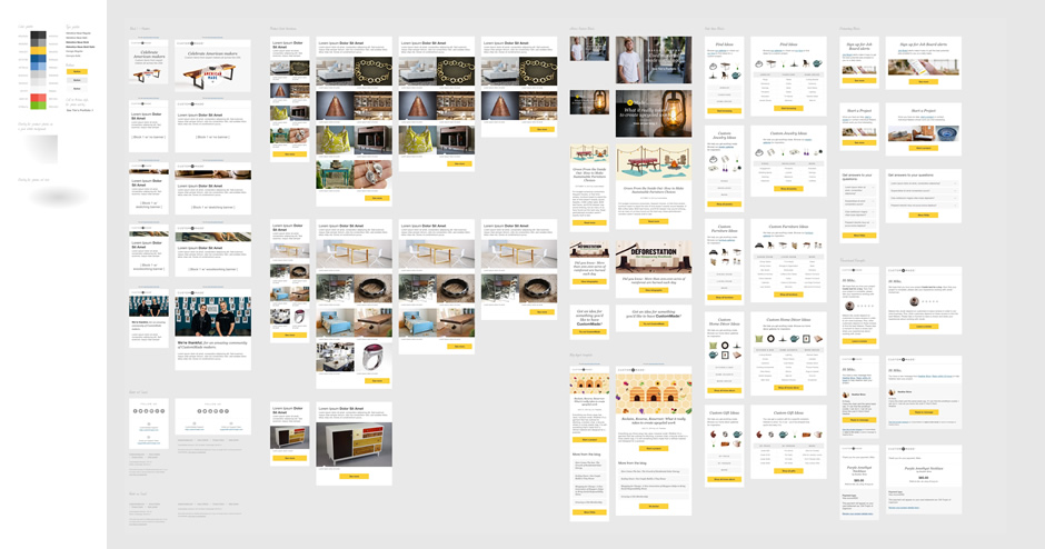
Onboarding Emails:
New Customer Welcome
New Maker Welcome
Transactional Emails:
New Message from a Maker
Proposal Received
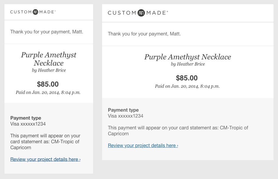
Receipt for Payment
Leave a Review
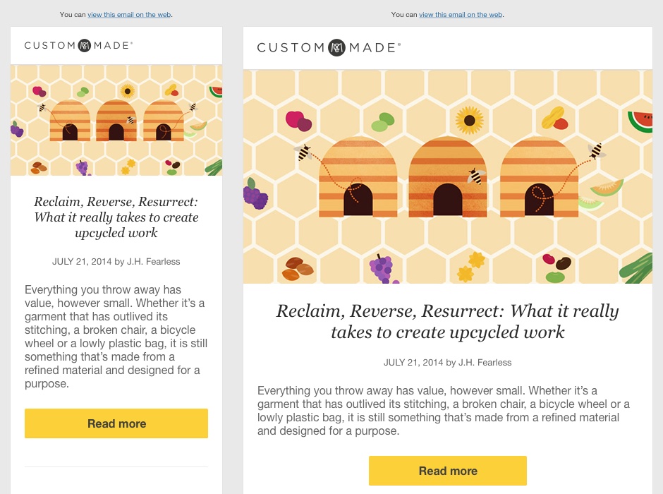
Blog Updates:
Weekly Digest
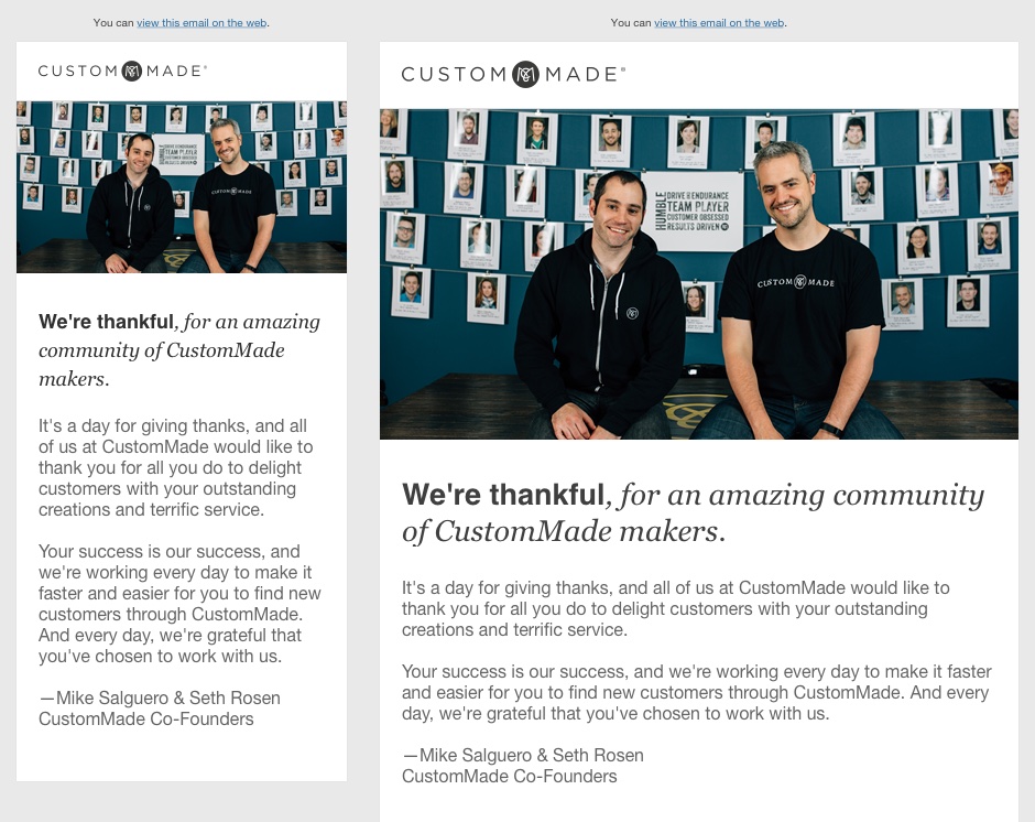
Maker Community Comms:
Year in Review
Thanksgiving Message
Marketing One-offs:
Small Biz Saturday
Contest Winner Announcement
Customer eNewsletter Series:
Celebrate American Makers (July 4th)
Jewelry Styles
Home Furniture
Home Décor
Shop Holiday Gifts
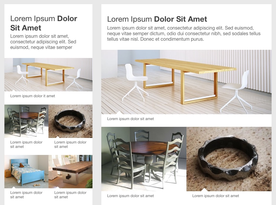
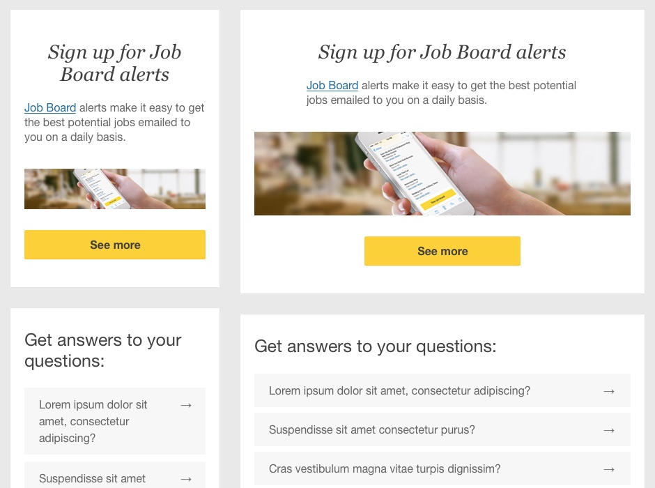
New Responsive Email Design Patterns:
Surrounding Images (Valentine Gifts)
Side-by-Side (Daily Digest)
Faux Masonry Demo
Featured Product(s) Grid
Onboarding
Transactional
Blog Digest
Maker Community Comms.
Email Atomic Design Library (Sketch)